Hello all! I am very happy to share with you my
first projects as a Green Tara designer.
. My name is Marie-Josée Hamel and I live in Canada.
I am very excited to be part of the Green Tara design team
and I hope you will find my projects inspiring.
As you will see in today's post, I am a big fan of white
backgrounds and flower clusters.
You will find them on almost every layout.
Without further ado, here are my first Green Tara projects.
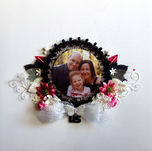
"Us" layout:
I really like to create monochromatic layouts with a touch of
black and
white.
In this case, I did the opposite: I used mostly black and white
ornaments with just a touch of color, hot pink.
I love this touch of
color,
because it makes the yellow tones of my picture stand out.
I framed my circle with a black Green Tara "Bud N Bow" ribbon...
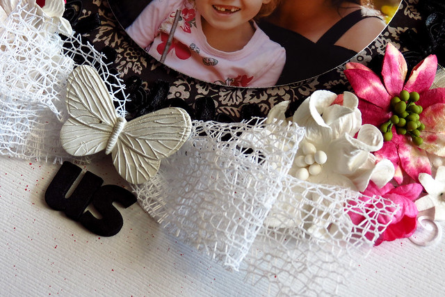
I folded another piece of ribbon (the white one) to create a big bow.
I prefer to fold those big ribbons than to tie them like we usually do,
because it helps to lay them flat on layouts. I used twine to tie it
and put a resin butterfly on top to hide the twine.
Green Tara supplies used:
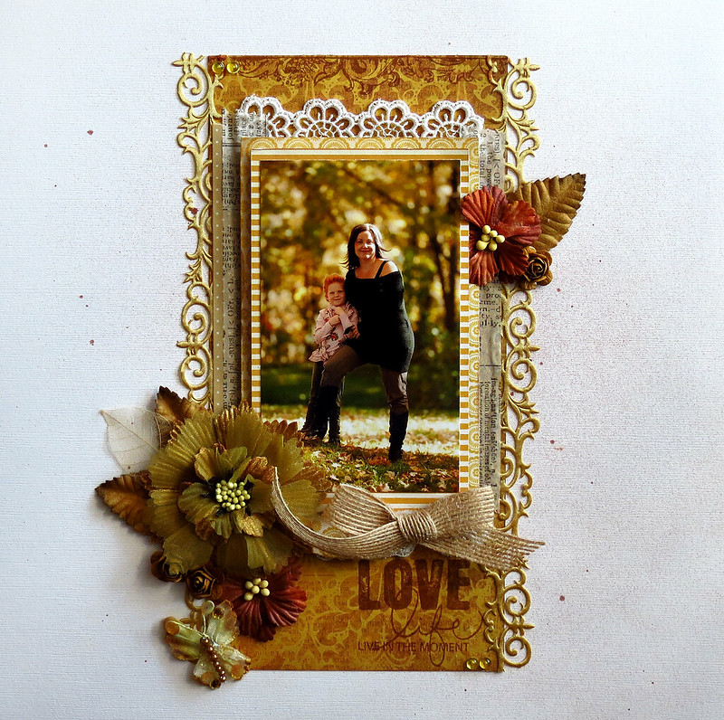
"Love Life" layout:
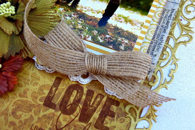
Speaking of monochromatic layouts, here's a fall layout in yellow tones.
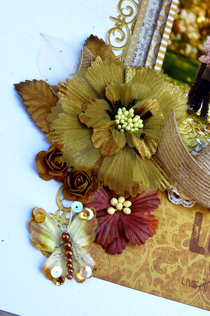
I love the big Damask organza flowers. Combined with
smaller flowers, they create a perfect cluster!
Green Tara supplies used:
Rain Forest Velvet and Organza Butterfly 3cm Bronze
Damask 8cm Fabric and Organza Flower Mustard
Rain Forest Velvet and Organza Butterfly 3cm Bronze
Damask 8cm Fabric and Organza Flower Mustard
"Adore" layout:
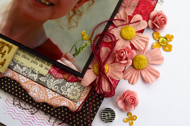
I submitted this layout for a color challenge on the
ScrapFriends blog and used a few pink Green Tara flowers on it.
Have you noticed that I cut all the green leaves out of the flowers?
This way, I was able to stay true to the colors of the palette.
I submitted this layout for a color challenge on the
ScrapFriends blog and used a few pink Green Tara flowers on it.
Have you noticed that I cut all the green leaves out of the flowers?
This way, I was able to stay true to the colors of the palette.
Remember to visit us on FACEBOOK too.
Marie-Josee




Stunning layouts , great first post, I love white space but am guilty of over loading my pages lol. Can't wait to see more.
ReplyDeleteThese look AMAZING Marie-Josee.... Love your monochromatic style & the white space!!
ReplyDeleteOh my goodness, wow!!!!! These all three are oh so stunning, so perfect!! I love the fairly simple designs with so much impact, just gorgeous!! Beautiful creations.
ReplyDeleteLooove all these MJ & I have to agree with Linda, I love the white space but I just cannot do it myself!!! I'm the queen of "just a bit more" I don't know when to stop. I love all of these beautiful layouts & I have to say a fantastic first post too. Cheers Di xo
ReplyDeleteMarie these are STUNNING! Fast becoming a huge fan of your work - you are amazing girl.
ReplyDeleteThese LO are just beautiful. You are very creative and talented. Looking forward to seeing more of your work in the future.
ReplyDeleteI LOVE your layouts! Your style is gorgeous!!
ReplyDeleteBeautiful layouts MJ - I love your colours and can't wait to see more of your work.
ReplyDelete